Tuesday 26 February 2013

Final Title Font


This is the font that our group has chosen which was influenced by our school members who participated in our survey. We all decided that this font did definately look very good and stood out very well when placed on a black background this makes the font bold and impressive. Even though we did use basic colours such as black and white they work very well together to create a dark atmosphere. By using such simple colours like white on black makes the 'INHERITED EMPIRE' look highly noticeable and catch the eye of people. This will be used at the end of the sequence we hope that this logo will also stay in the auidences mind.

Monday 25 February 2013

Audience Research For Fonts

When we was deciding which fonts to use for our main title sequence we decide to carry out an audience research task to see what they felt was best. We asked our class members for there feedback and then also asked other students to see what they felt was best overall. It was clear that two fonts were most popular and there suggestions were that the they looked the most bold and would stand out the most. Overall the final choice that the students made was Font 2 they felt that it fitted best with our sequence and also looked bold and stood out , they also stated that it would fit well with the genre as most gangster crime films use bold fonts. I have included a graph to show the results of the research carried out.


Saturday 9 February 2013

Burning Of The Briefcase

This shoot was very important for us as a group as we only had one briefcase therefore we didn't have the opportunity to re-shoot if we made mistakes like we was able to do in other scenario's this meant that we had to make sure that everything we done on the shoot was near on perfect. As we was using fire in this sequence we had to prepare and make sure that it was all safe we also had a bucket of water to hand just incase the flame got uncontrollable. As we was filming outside and it was dark it was very important that the lighting was good so that the footage on the camera didn't look to dark or to bright. As you can see from the photos extra lamps were used so that the lighting looked perfect. The whole idea behind the money burning in a briefcase is to show how Anton Lewis is trying to get rid of all of the corrupt money that his dad still had and to show that he now wants to forgot all about the previous dishonest life that his father had lived. Overall we were all very happy with this footage and felt that we caught some excellent shots whilst filming. When editing we are going to introduce this footage towards the beginning and also towards the end so that audience don't forget about how important it is. As a group we also suggested that this footage could also be used as our last shot as it shows Anton Lewis closing the briefcase lid with smoke coming from small gaps on either side. This would look every effective however this was just a suggestion and we may think of a better idea.


Friday 8 February 2013

Audience Research On Hospital

As previously mentioned our group decided to carry out an audience research task to see which hospital they felt fitted best with our sequence. Firstly we showed our class and then we asked a few other classes for their opinions. We showed them what each hospital shot would look like in our sequence and 'St Thomas Hospital' got more votes. Most people said that they preferred it being shot in the night therefore thats why the majority chose 'St Thomas Hospital'. To record peoples choices Harry made a tally chart on a piece of paper which he then transferred to the computer and produced our results in a pie chart. Below are pictures of both the tally chart and also the pie chart.


Thursday 7 February 2013

Feedback from class


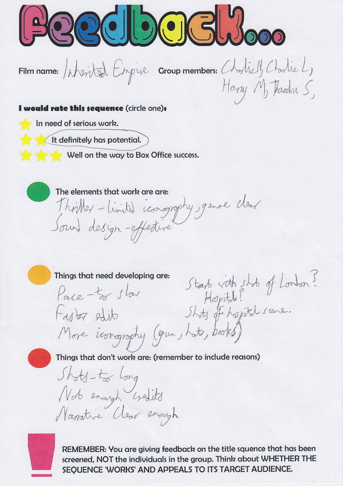
Here are the feedback sheets that we received from class. Overall the feedback we received was positive and helped us to improve our title sequence. We received two and three stars on our sheets which means that the class felt that our title sequence definitely had potential if it was improved to a better standard. The main criticism that we was given was that our ending which is the hospital scene come across as confusing because it didn't quite seem to fit with the rest of the sequence. Our sequence includes lots of short videos from famous landmarks in London and by us cutting to a hospital scene it may have come across as confusing to the audience. To improve on this our group is going to travel to London and get a shot of the front of St Thomas hospital so that it signifies that it is set in a hospital. We will then include this shot into our title sequence so that our ending is a lot more understanding for the audience. The class also said that each of our shots were to slow therefore we decided to speed them up but struggled doing this therefore we found out how to do it we corrected them and it looked alot better. A piece of positive feedback we received from the class was that our soundtrack we chose was very good. All of the groups commented on how they felt the pace of the ticking clock fitted in well with each of our different shots. They also said that the sound of the ticking clock creates tension for the audience which is what we wanted.
Overall the feedback we received was generally positive therefore we was pleased with it. We also agreed with the feedback about the pace of the shots which we have now corrected. By us listening to the feedback it has made us think about what else we might want to change to our title sequence to make it better.


Wednesday 6 February 2013

Shoot of Hospitals

Below are the pictures that we took of two hospitals in London. When showing our title sequence to the class they all agreed that the hospital scene was rather confusing therefore we decided that we should include a photo from the front of the hospital to make it more clear to the audience that it is going to be shot in a hospital. We decided to shoot 'St Thomas Hospital' and also 'Chelsea and Westminster hospital' as a group we thought that if we shoot two separate hospitals it will give us more of a choice when deciding what one we want to include in the title sequence. 'St Thomas's' looks very effective where it has been shot at night which fits perfect with our film and it creates quite and tense atmosphere but on the other-hand 'Chelsea and Westminster hospital' also works quite well as it includes a London taxi which is very iconic for a british movie and that is also what we want to portray to the audience. We have decided that we will carry out an audience survey to help us decide what hospital will look best for our sequence.